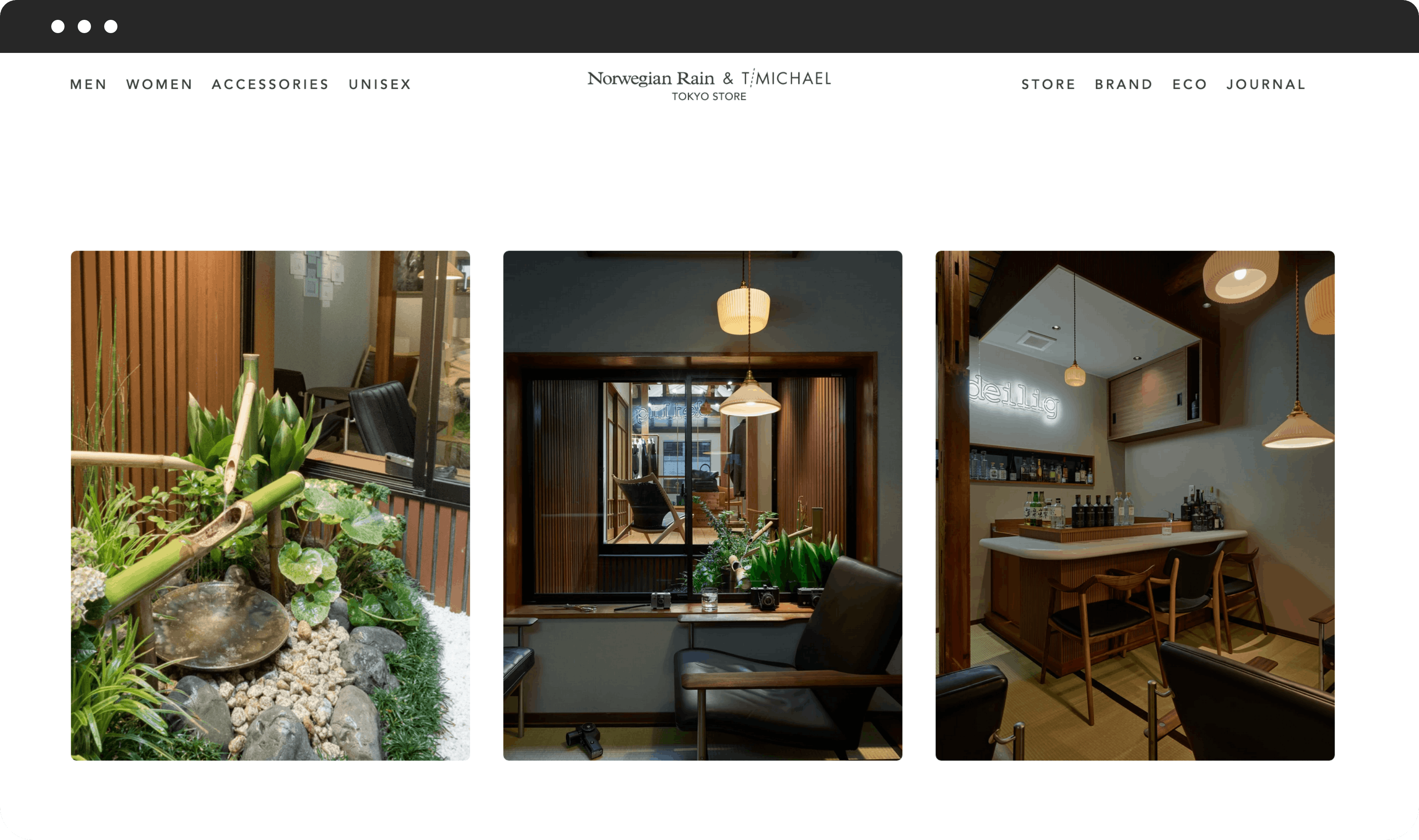
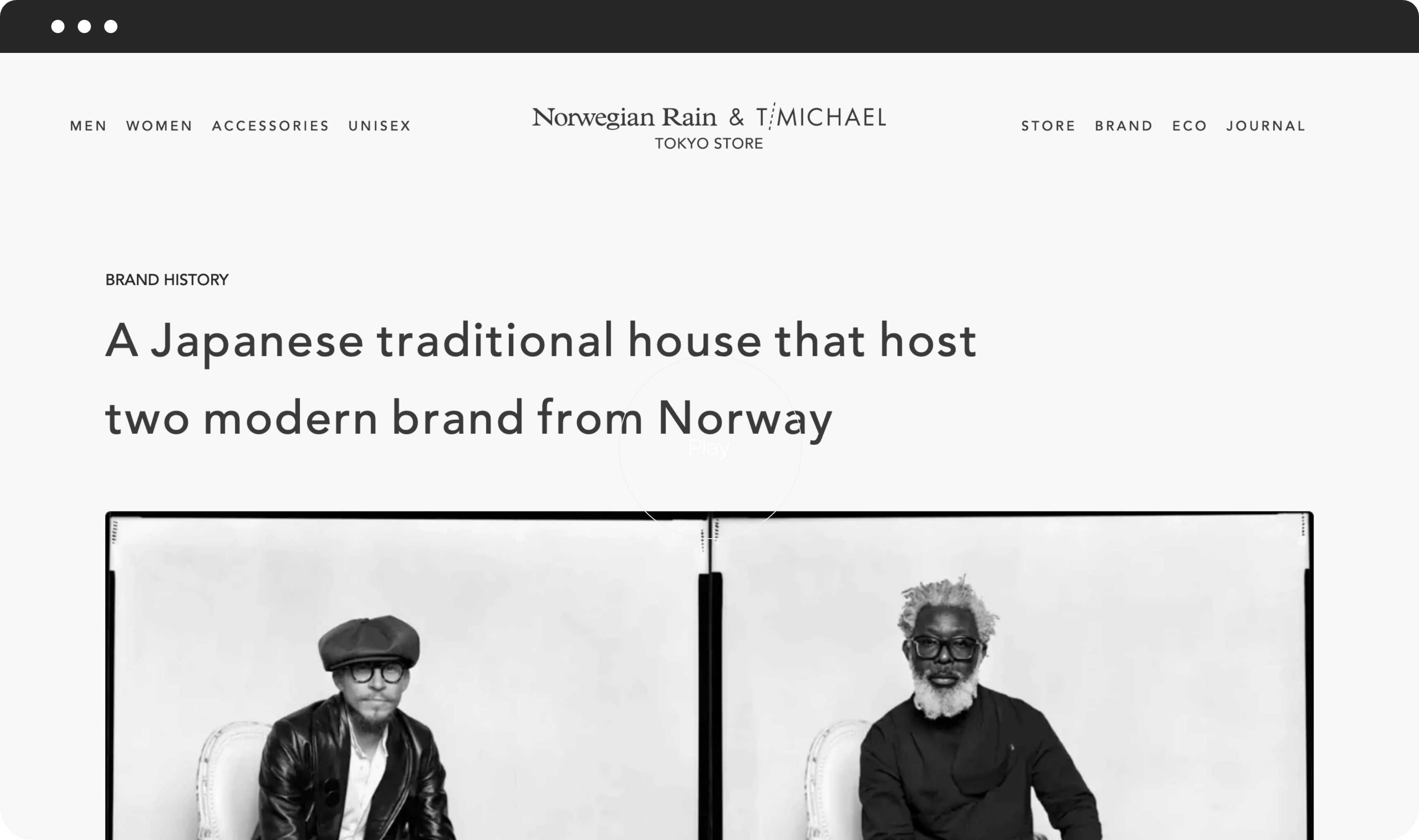
Norwegian Rain & T‑Michael Website
Client
Norwegian Rain & T‑Michael
Category
Retail + eCommerce
During the Covid pandemic, customers have limited chance to experience Norwegian Rain's concept store.
- Experience Strategy
- Creative Direction
- UI/UX Design
Overview
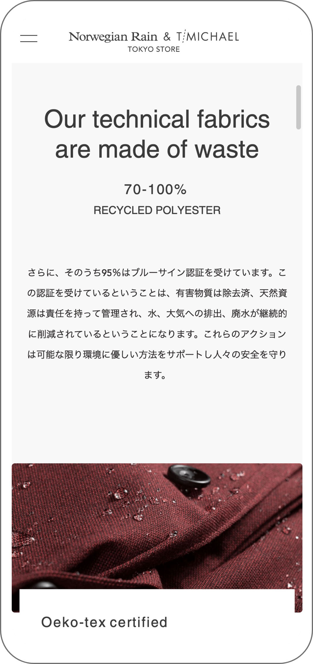
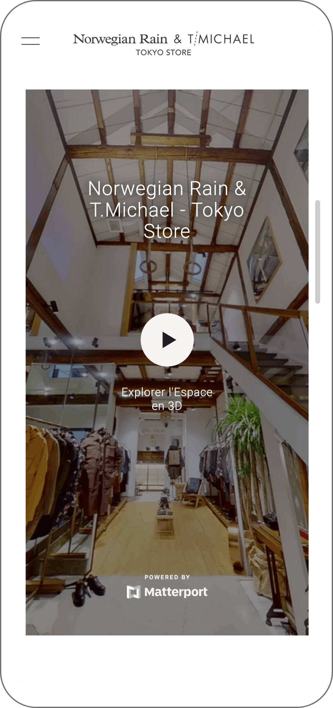
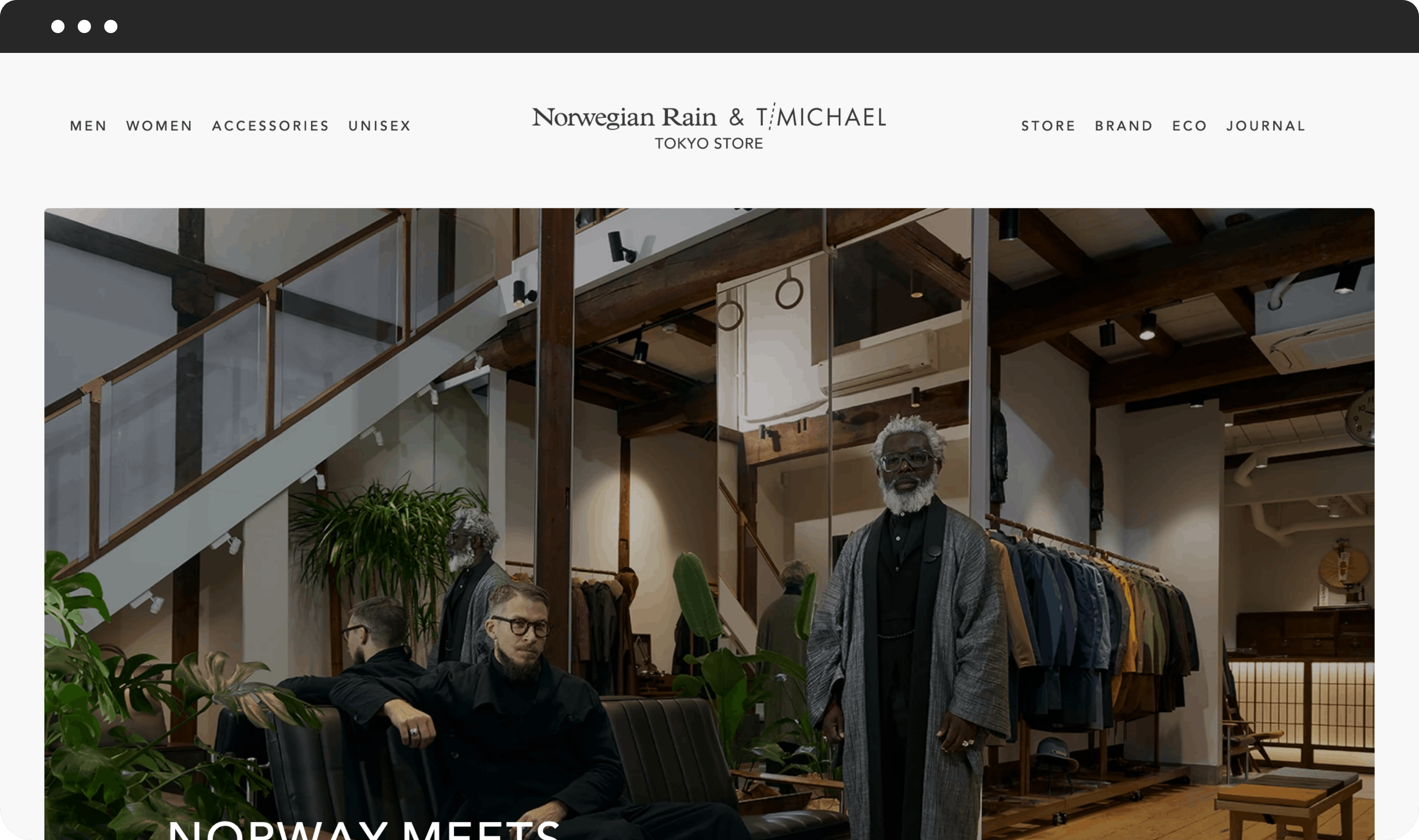
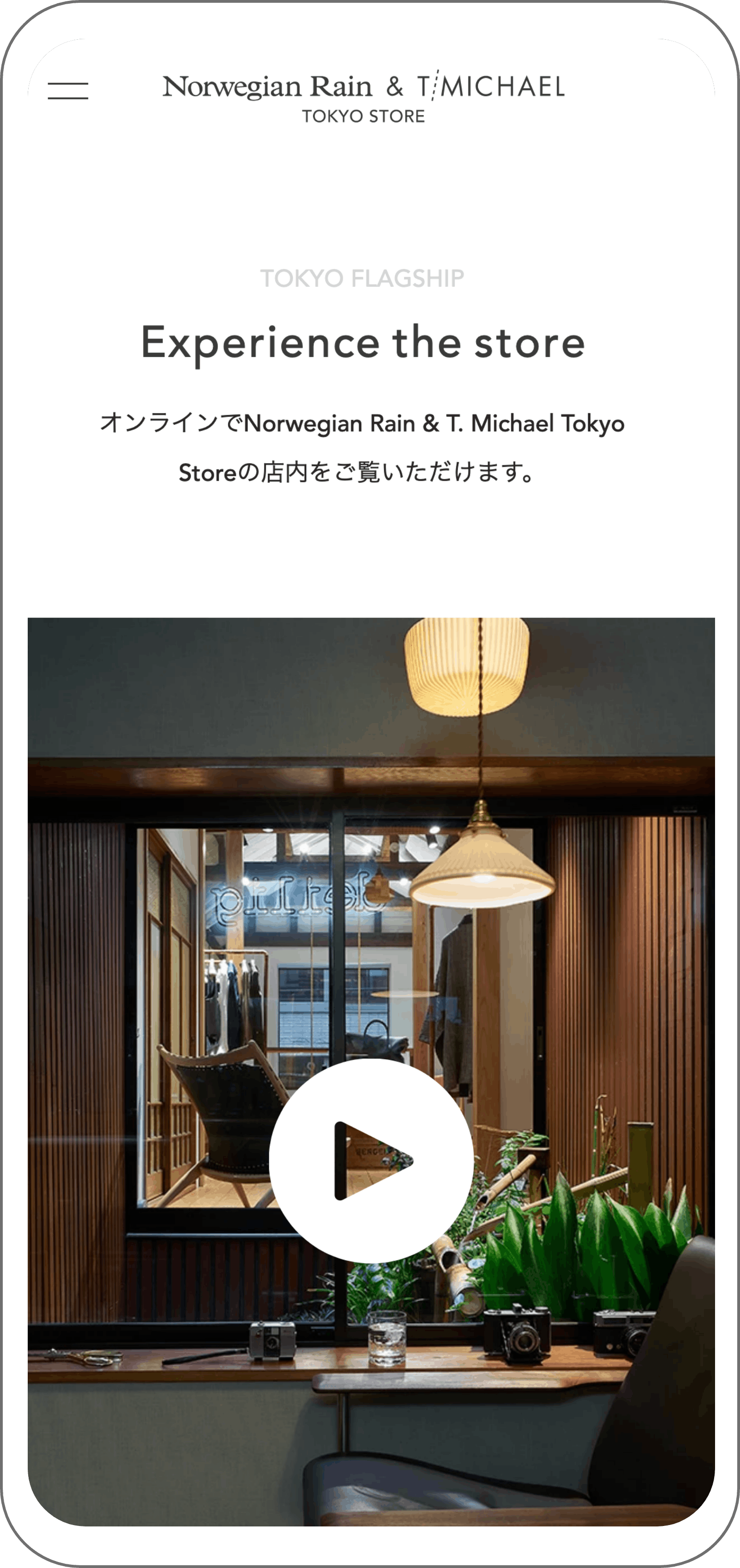
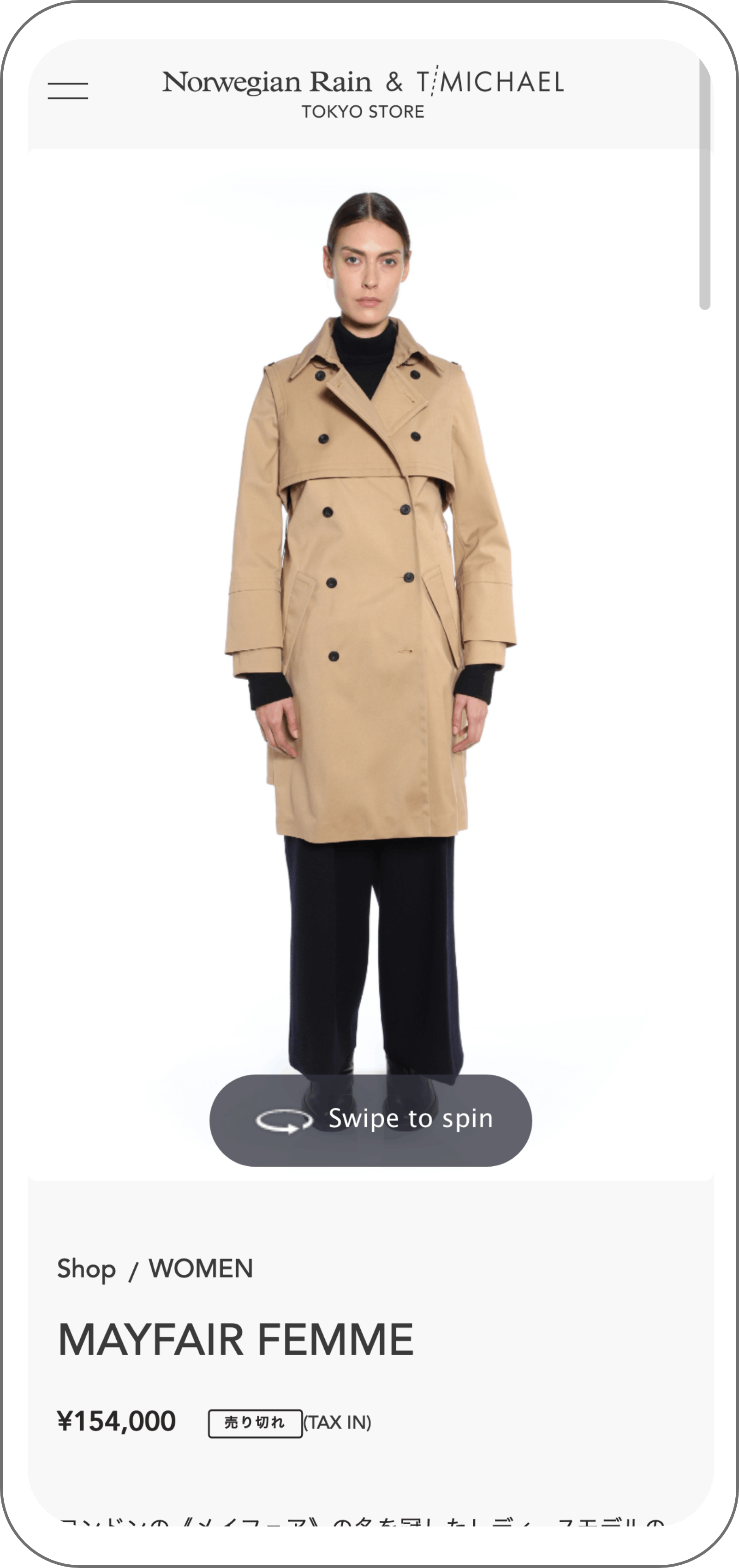
The client wanted a simple and attractive website where the end user could experience the Norwegian-Japanese combination of their concept store trough the website. Because of the pandemic situation, most of the retail stores have limited time to stay open and only a few customers can visit in person. We had a chance to build a website that not only has an e-commerce purpose but also use recent 360° technologies to allow customers to have a meaningful experience.
Responsive
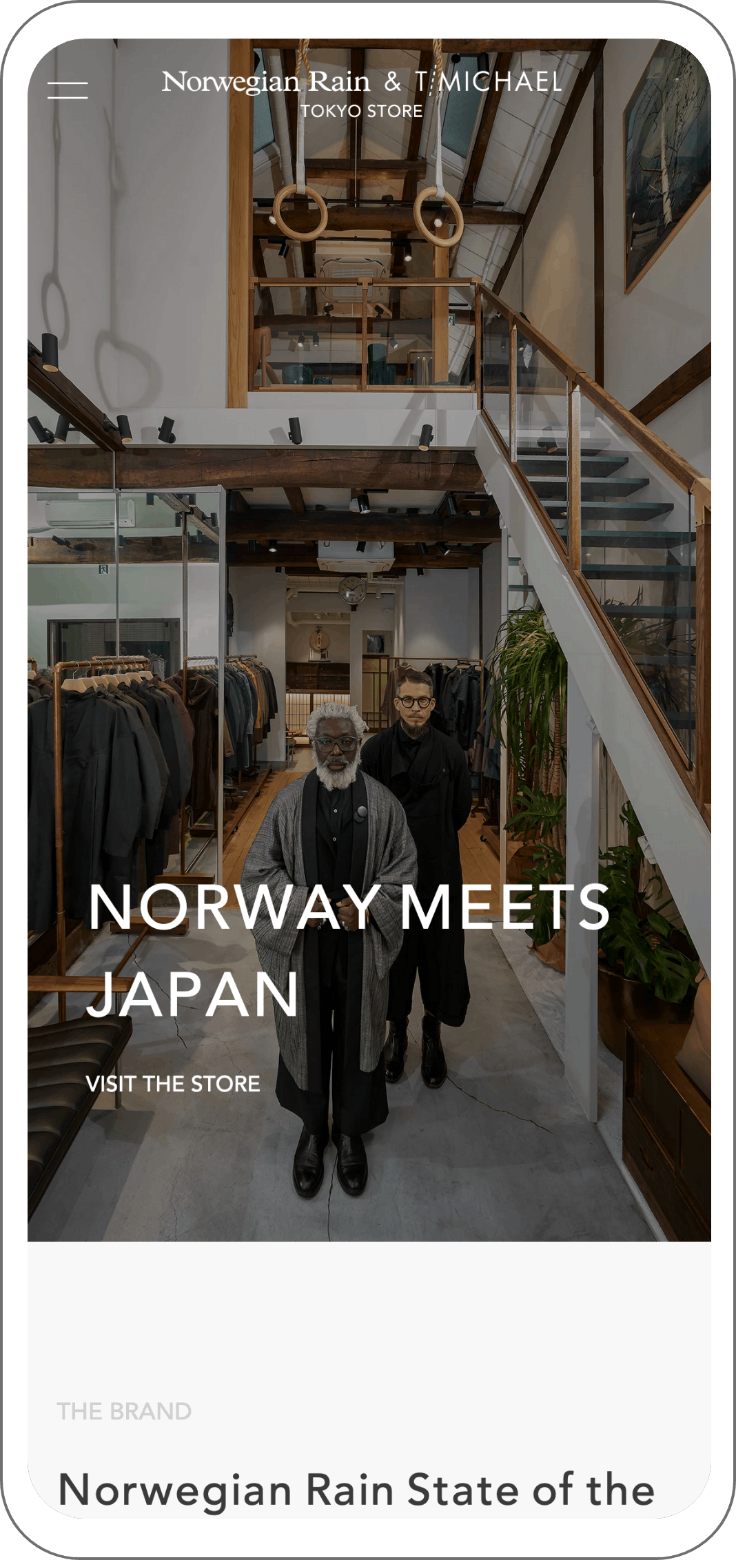
A long-term relationship committed to bringing the best of Norwegian Rain to Japanese market
Process
- Defining the problem. With a very wide range of products, the quality of clothes tends to deteriorate and products may not look exactly the same as displayed. It creates a need to build a sophisticated platform where quality, aesthetic and brand story are balanced.
- Empathize. To start the process we had to go the store to grasp the experience a customer feels when visiting the store directly.
- Visualization. The goal of this end product is to deliver a meaningful experience with a simple yet attractive UI/UX. The best choice was to build a 360 shopping experience to increase the reach and impact on customers.
Responsive
